Monday, June 4, 2012


Poets in the Print Shop

June 1, 2012, 3:06 pm
By Lisa Russ Spaar
Several years ago a colleague in the studio art department and I team-taught a course we called “The Matrix,” an experiment in bringing together eight advanced printmaking students and eight advanced poets to make new work, including several high and low-end collective books. A matrix, in the printmaking lexicon, refers to the plate—zinc, plate, copper—or other material (stone, collage) used in printing, but when we advertised the course we had a lot of interest from initially thrilled and then bitterly disappointed fans of the 1999 science fiction film of the same name, undergraduates who thought that it was high time that the cinema icon got the serious attention it deserved in the academy.
There was much enthusiasm among the young artists and poets as well, of course. , and our idea as instructors was to throw them (and ourselves) into the water, with the presumption that our disciplines—poetry writing and intaglio printmaking—were distinct enough to generate fruitful friction and close enough to allow for revelatory and empathetic artistic exchange.
This “throwing into the water” turned out to mean many things, perhaps chief among them the potentially dangerous fact that although half the class had never before set foot in a print shop (described by my art colleague as a “15th-century chemistry lab without the safety features”), we were almost immediately involved in processes using acids and other toxic substances. Most fumes emitted in poetry writing workshops tend to come from the ubiquitous coffee cups and from occasional traces of cigarette smoke brought into the room after breaks; by contrast, we regularly left the print shop with filthy hands and heads high as kites from our unaccustomed breathing in of acetone, inks, resins, and other substances in a myriad of containers marked with skulls and crossbones.
Another learning curve for the poetry students was an initiation into the time commitment involved in the serious pursuit of studio art. The typical advanced poetry workshop meets for three hours once a week; print-making courses meet for two-and-a-quarter hours twice a week.  Our particular course was scheduled in the mornings on Tuesdays and Thursdays, commencing at 9:30 a.m.; allowing poetry students to explore their consciousnesses before, say, noon was another gift of the collaboration. And while it is understood that the advanced poetry student commits a lot of out-of-workshop time to musing and writing independently, this activity can be done in coffee shops, bars, subways, or in the privacy of one’s bed or bathroom. Printmaking students also devote many, many hours outside of class to generating and completing projects, but this work must be done predominantly in the print shop. Another ambivalent plus, then, for the poets was the discovery of a new (and there aren’t many) 24/7 venue in Charlottesville.
Despite the fact that the studio art department had been relocated for the two years that we taught “The Matrix” to two ventilated, corrugated metal, temporary outposts while a new, state-of-the-art facility was being built, despite the early hour of our class, despite the time commitment and the extra work (my colleague and I both taught the course as an overload to our regular Departmental course commitments), the matrix experience was intensely rewarding. I found the printmaking students, who were used to experimentation and to thinking on their feet, to be exceptionally open to the making of poems, even though most of them had never attempted poetry writing before. Perhaps because intaglio printmaking is a “negative” art (what one etches shows up in reverse on paper; what’s etched away appears dark, and vice versa), “opposite” exercises (in which students “pull” new poems off of extant ones) yielded exciting new work; similarly, write-in, erasure, and strike-through exercises used techniques familiar to the printers, who were used to staining, gesso-ing, Chine-collé layering, and all manner of obscuring, illumination, and multi-valence. As part of the course, all of the students were engaged in semester-long, serial, “flood-subject” projects, both individual and collaborative.  As printmaking is intrinsically serial, this aspect of the course also came naturally to the print-makers.
As the poets and printmakers collaborated over time, the poets became more comfortable with a fresh range of attitudes, vocabularies, processes, and energies.  We became less anxious about “ownership” (while poets are sometimes fiercely territorial and proprietary about their productions, printmakers tend to seek ways to creatively sabotage, manipulate, and in other ways sample and become involved with each other’s work) and also more comfortable with foregrounding the processes of our drafts rather than privileging the final product. Often, for example, something marvelous would result from a “mistake” that a student might make along the way—an over-bitten plate, or an aberration caused by burring or over-inking.  My colleague would point to the print (and here’s another exciting difference between poetry and printmaking workshops:  In poetry classes, the works under discussion are passed around on discrete pieces of paper or viewed on laptop screens, while in the print shop all work on paper is posted vertically, tacked to the wall, for the community to see) and say, “Look, that’s amazing. Now figure out how to do that deliberately.”
We talked a lot, as we worked together, about “the stain” and about defacement, about the line, about the bleed. All of these printmaking phenomena, new to us poets, had exciting parallels and possibilities in poems. Crucially, we learned about and made paper.  We also learned to create, stitch, and bind folios.  We dyed endpapers, and covered and glued and pressed hardcovers. For one book project, we were privileged to work with a metal artist, who showed us how to use gilt and lapis to emboss a front cover.  I doubt that any poet participating in the “Matrix” course now looks at or handles a book without thinking of its materiality and its making.  Printmaking discourse also provided the poets with a trove of new words, all, again, with suggestive resonances in poems, as well, terms and phrases such as false bite, bon à tirer, burin, mezzotint, criblé, creeping bite, and retroussage.
Of the many gifts of the printmaking experience for poets in the “Matrix” class, perhaps chief among them was the reminder to writers working primarily in digital media (computer and other virtual type) that writing is, or can be, drawing.  And lines drawn by hand, whether etched into a metal plate or scrawled across the blue staves of a Moleskine notebook—forays made into the matrix—possess an inimitable warmth and immediacy of expression and effect.  Printmaking reminded us to attend to the ghost, to the mark, of what Keats called our “living hand” in our poetic efforts.  The materiality of our techniques was revealed to us anew with each pull of a print, each dip of the plate into its acid bath, opening us up to the crucial connection, in all art, between idea and praxis, and, importantly, to the power of mistake, flaw, and the grace of a hand-made thing.
Lisa Russ Spaar is The Chronicle’s poetry blogger and a professor of English at the University of Virginia.
Chronicle of Higher Education, 6/4/12

Monday, May 21, 2012

Color Project

"The Chocolate Library"

The Nantucket Poems

Recordings of my poems written for my Final Project.


The Trajectory of Flying Memories

I wrote 8 poems for my final project and performed them in class.  Here is the first one:


The Trajectory Of Flying Memories

Hand in hand, we stand in line.
One in front of another
Like a row of corn,
Heads bowed
Shoulders hunched
Waiting patiently
In anticipation
Of what we do not yet know.

One by one
The man behind the counter stamps
The watermarked pages,
Crisp clean,
Dog-eared,
Creased perhaps,
Or slightly fraying at the edges,
A history of where,
A record of who.

Weighed down by where we've been
And where we have yet to go,
I cannot seem to see past
The immediate next flight of stairs.
Just then,
A little girl
Clutching her mother's dress
Points to a sign behind us
And I follow the line of intent
To let my eyes linger a little longer.

Silently, I turn to face forward,
Looking ahead
While I tuck my lingering glances
In a safe nook
In the cradle of my heart.


Tuesday, May 15, 2012

Audimmersion


Hey everybody,

Sorry for the delay. I've uploaded my audio file for my file project to the link below. My project deals with the emotion of isolation, the audio I've recorded exemplifies the effort to combat that feeling. Growing up, I lived in the presence of cars, traffic, and passersby, only to lose them during my move to Providence. I didn't quite know until they were taken away just how comforting those sounds could be, and just how much they could affect my mood.

The track is ideally listened to in the following environment:
  • A personal, quiet space.
  • On a relaxing piece of furniture.
  • With the windows closed.
  • With your eyes closed.
  • Laying down in a comfortable position.
  • At a time right before you lay down to sleep.
Please take the time to listen, I hope you enjoy the experience.

Thanks,

-Jake

jake's final project

AUDIMMERSION

Saturday, May 12, 2012

Book Review by Afton Wilky (RISD BFA Painting 2005, Louisiana State University MA in Rhetorical Theory, MFA in Poetry (with distinction), 2012


A THOUSAND SEVERAL
Emily McVarish
by Afton Wilky
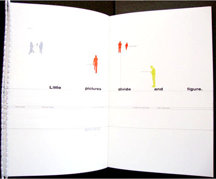
IA Thousand Several, Emily McVarish explores the space of a book through its relations to cityscapes. As if she has positioned her reader at a busy intersection, each page becomes a place that text and image move into and out of. In this way, the experience of reading A Thousand Severalfeels more like turning the pages of a flip book animation than following a continuous line of text from left to right and top to bottom.
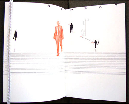
The sense of motion produced by figures photographed in the act of walking, extends McVarish’s earlier experiments with duration and presence. In both A Thousand Several and Was Here (2001), words and images are the empty shells of what has already passed. By rendering the figures as silhouettes, outlined forms, or monochrome cutouts, McVarish calls attention to layers of blankness that accompany forms of representation. Additionally, by flattening three-dimensionality and cutting the figures out of their original context, she produces a page-space at once strange and familiar. On these pages, both image and text float until they intersect with another figure; this intersection cuts and connects at the same time.
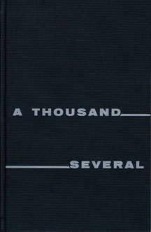
It’s these “risk-slits” and “torn encounters” which surface as the subject of A Thousand Several. Once the “thin outer coating” of the book is opened, the “several” of the title becomes “sever al” on the title page, suggesting that the wholeness of words is merely the layer most often seen. “Kept in parts,” and “built in passing,” language and image are understood here as the sum of letters, outlines, and shadows, and as the “byproduct” of what is now over. By these terms, cuts seem to bleed glue.
The hyphen may be the perfect model for this cut/glued condition of language, since it literally “divides and figures . . . streets and open spaces” on the page. Straddling distinctions between text and image, the hyphen can be both a punctuation mark and a line. Here, thousands of hyphens strung together into dotted lines create the cross section of a “street” which cuts across each page.
Often, these lines darken a large stripe across the book, which appears strangely flat in relation to the depth suggested by the floating figures. However, like McVarish’s figures in which there is a range offered between silhouette and outline, a dotted contour also indicates this street. In this way, the street demarcates a space for occasional crossing and for the traffic of words.
Fluctuating between fullness and emptiness, the street refigures a dilemma of language and image—a dotted line fills in space at the same time that it draws the line to be cut along. The street then alternately makes visible and invisible the sedimentation of cut-marks. As can be seen in the second image, if we drilled all the way through this sediment, we would find ourselves in another world, or at least on the inside of a mirror. The implications of these organizations are further compounded when we realize that the cross section of this street might also be seen as the cross section of a book.
What takes shape in McVarish’s work, through the interaction of grounds, forms, and the text itself, is the idea that a word or an image is always a figure in unseen motion. Like a city, A Thousand Several is an amazing trace of its struggle, holding open the space of its passing by.

Wednesday, May 2, 2012

Assignment 2: Sound

Re-translation of a a recording of one of my original poems, 'Aqua', into an evocative space of sound.


AQUA

Tuesday, May 1, 2012

Andrea on Ingold

"He takes a one dimensional term and constructs a four dimensional idea."

Monday, April 30, 2012

Pantone shades of yellow.


Yellow Iris, Lemon Zest and Solar Power, some of Pantone's shades of yellow
Courtesy Pantone.

Thursday, April 26, 2012

Lines

"This book is shocking, in a way.  Conceptually it introduces a new idea by highlighting the obvious ... 
It is shocking to open a book to find an interesting unfamiliar idea -- and then have it applied to ALL THINGS."  (Sophie)

"Tim thinks line can change the world." (Jennifer S)

Reading Lines will inevitably affect my sight until the book is out to rest.  I am sitting in this room, seeing all the lines I never saw before.  Of course I have seen them all before, many times, but it isn't until now that they come into focus and have new purpose.  I am trying to imagine how Tim Ingold must feel.  In a way, lines must be a disease for him; a plague which he cannot escape.
(Note: If I had to have any plague, I would most definitely choose the line plague, so I sympathize with Ingold)

I don't think this book is proving any kind of argument, but rather offering a showcase for all the lines which are overlooked or generally unknown.  (Anna)

around risd


Love Song: I and Thou

BY ALAN DUGAN

Nothing is plumb, level, or square:
     the studs are bowed, the joists
are shaky by nature, no piece fits
     any other piece without a gap
or pinch, and bent nails
     dance all over the surfacing
like maggots. By Christ
     I am no carpenter. I built
the roof for myself, the walls
     for myself, the floors
for myself, and got
     hung up in it myself. I
danced with a purple thumb
     at this house-warming, drunk
with my prime whiskey: rage.
     Oh I spat rage’s nails
into the frame-up of my work:
     it held. It settled plumb,
level, solid, square and true
     for that great moment. Then
it screamed and went on through,
     skewing as wrong the other way.
God damned it. This is hell,
     but I planned it. I sawed it,
I nailed it, and I
     will live in it until it kills me.
I can nail my left palm
     to the left-hand crosspiece but
I can’t do everything myself.
     I need a hand to nail the right,
a help, a love, a you, a wife.
Alan Dugan, “Love Song: I and Thou” from Poems Seven: New and Complete Poetry. Copyright © 2001 by Alan Dugan. Reprinted by permission of Seven Stories Press.

Source: Poems Seven: New and Complete Poetry (Seven Stories Press, 2001)

titles

Lines: A Brief History


The Uses of Enchantment: The Meaning and Importance of Fairy Tales


Trickster Makes This World: Mischief, Myth, and Art


The Black Paintings of Goya


Frida Kahlo: The Painter and Her Work

first paragraphs

Iannis Xenakis: Bridging the Gap between Music and Architecture


The possibility that there is a connection between music and architecture is a topic that has been widely debated throughout history.  The topic has no concrete answer, for it is an area that is still being constructed, defined and questioned.  Because architecture and music function on two different planes it is an interesting opportunity for thinkers to discover the potential links between the two art forms based on similarities in their basic structure and principles.  This desire for the connection of two very different mediums is in essence poetic.  the great musician and architect Iannis Xenakis set out to try and bridge this gap, and in the way created some amazing examples of visual poetry in the form of architecture.  This essay is an attempt to understand how there could be a link between music and architecture, and why acknowledging a potential connection could be of great importance to the world of material poetics. 


The Movement of Medium and Meaning: An Eye on the Migrations of Fascicle 16

How often do we consider the visual stimulation of the written word?  We read words; we hear in our heads how each word sounds, but how conscious are we of the connections between the way a word looks and how we perceive it?  A handwritten word has more character and emotion than a printed word, and in turn, the digital word has a nature entirely of its own.  The way we perceive and digest written language is directly connected to how it is presented to our eyes.
The progression of Emily Dickinson's Fascicle 16 exemplifies the linkage between the character of a poem and the way in which it is displayed.  Each of Dickinson's fascicles is made up of individual handwritten poems, which she grouped and bound.  These primary sources are scripted gems, personally marked with intention and emotion.  In time the fascicles have been published in many different forms, on paper and on the web.  Taken out of their original context, the poms lose the gestural qualities they once possessed, and the sense of meaning given by the author's penmanship.  However, sometimes what is lost can be regained.  In attempt to revisit handwritten qualities, Jen Bervin, an artist of both text and textile, made a series of embroideries based on the marks made in Dickinson's original poems.  These embroideries bring us back to the attributes of their source, but offer something entirely new.  the shifts between the hand-bound fascicles to print, to the web, and then to Bervin's interpretation, demonstrate a system of filtration.  The original qualities and meanings shift and distill from medium to medium.

library references


Bettelheim, Bruno.  The Uses of Enchantment: The Meaning and Importance of Fairy Tales.  New York: 
   Knopf, 1976.

Hyde, Lewis.  Trickster Makes This World: Mischief, Myth, and Art.  New York: Farrar, Straus, and 
   Giroux, 1998.

Junquera, Juan José.  The Black Paintings of Goya.  London: Scala, 2003.

Kamvar, Sep, and Jonatham Jennings Harris.  We Feel Fine: An Almanac of Human Emotion.  New 
   York, Scribner, 2009.


Prignitz-Posa, Helga.  Frida Kahlo: The Painter and Her Work.  New York: Schirmer / Mosel, 2004.

Friday, April 20, 2012

Lines 2

The relations to textiles  represents the great analogy that fibers have to lines.  Textiles are an architecture within a 2D element.  Complex crossing, knotting and structure make lines into forms.

Joe + Anders

The trace and thread belong together and must exist alongside each other.  One is an active exploration, the other a record, but the lines can become both in many circumstances.  Surface, for example, stems from this.

Lauren, Esmé, Emily


-- more physical, tangible subject matter in this chapter.
-- Ingold still seems to tackle too much in one chapter.
-- more a study of the nature of people than the nature of lines.
-- looking at people through the line.
-- the line is a method to understand humanity.

Kyle, Josh, Anna, Wesley, Jen

-- You could describe almost anything in terms of lines.  As such, Ingold's taxonomy of different types of line seems arbitrary, and not necessarily useful.  The question then is whether or not line is a useful metaphor.  we think it is.


-- We are interested in the way threads come together to form surfaces, and vice versa.  This is a good metaphor for culture.

Emma, Tracy, Hania, Eric


Lines 1

-- How would you express sound without lines
-- translation of sound into line
-- four lines of the staff -- created a concrete wall separating sound and incanting.  People can "see" sound as if was conceived without ever needing to hear it.

Wes, Jen, Anna, Josh, Kyle

-- meaning of words are supposed to lie behind the sounds
-- sound cannot belong to language
-- all writing speaks, we read to listen
-- the surfaces of lines might be similar, but their nature often differs, e.g., language and music
-- the fundamental change in our experience of final project lies in moving through verses looking at.
-- only experiencing end product obscures journey and the authors.

Avery + Aaron


-- We think that Ingold is too quick to dismiss the importance of tone and inflection in speech.


-- We think the distinction between sound and meaning is a Western one.  Take Chinese, for example, where tone is essential to meaning.


-- There seem to be many exceptions to this rule, i/e/, script for plays -- written words that denote how speech is to be performed.

Emma, Tracy, Hania, Eric

The silence of the written words is a modern convention that has not always existed in language.  By silencing text, we lose the journey of the voice and the emotion within lines that once was so essential.  Poetry perhaps contains the key to this lost richness.

Lauren, Esmé, Emily


Lines (Introduction)

Lines need not be straight, strict dividing lines. Lines can connect, trace, and weave. We're interested in Ingold's defense of the humanity of lines. We're not sure about calling a dotted line a series of moments. isn't every line an infinite series of points? In elementary school art class, they told us that a line was a dot that took a walk. STRING THEORY! 

 Emma, Tracy, Hania, Eric

The best part of the book. (It) offers what we need. "Everything is a parliament of lines." Favorite parts: Darwin + the dotted line. Arguments: Inconclusive Style: Linear, parallel, not meeting, oposite to cover illustration, parallel circuits, they do not conclude. 

Jen, Wes, Anna, Josh, Kyle

What is linearity?  Is it straight?  On a more critical note, is it what he claims it is: rationality and logical progression of reasoning?


Everything is a "parliament" of line -- made up of them and ruled by them.


Why are lines "static" and not associated with all things in the way that things really are -- continuous and connected?

Avery + Aaron

What is not line cannot be defined tangibly, digestible to our logic.  Humans are linear thinkers.  Color equals otherness, vague, ill-defined.  So homophobia is a good parallel when dessecting the notions of what "otherness" is.

Joe, Anders


Thursday, April 12, 2012

new rules

sit as close as you can
as close to the front as you can
help yourself to coffee
if you need anything else
say what you need
do what you like
those are the rules
where does authority for the rules reside?

Sunday, April 8, 2012

more xu bing (courtesy of jon)


poetics

For my final project I want to take my first assignment and add a shyness to the piece. (Kyle M)

That Old Library

There has always been something unique about the Old Library that separates it from other libraries.  I think rather than trying to block out noise and create silence, the Old Library provides a space that is inherently focused and separate from other activity, but at the same time is present in an environment that is full of it.  The world continues to move while you're in that space, and the design of its environment in no way tries to hide this fact, unlike other spaces.  I'm constantly aware of the sounds of the cars rushing by behind the rattling windows and clinking chandeliers, I feel just like I do when I'm laying down in my room back in Connecticut, I feel present among other living things, I don't feel alone.  (Jake Cooper)

buildings with libraries

a soft-spoken amenity

Saturday, April 7, 2012

blackle.com

blackle

and plenty more googles here

thanks erik!

on google

The colors of the google logo absolutely have an impact on the user.  The message is simple, primary, easy to use.  Perhaps the mixing of these primary colors yields an infinite amount of other colors so as to suggest an unlimited number of search results. (Kyle C)

Bright primary colors become an elementary part of our internet experience, our lives.  Simple, easy access to the world's stockpile of data has become the hallmark of our era.  In a way, the simple basic nature of Google's color represents a new age of learning, where everyone is in Kindergarten, where all the tools, knowledge, and expertise are made equally accessible to all the "students."  It has been statistically proven that once we assume information is easily accessible, we don't allocate memory space to it.  Hence, Google, in its simplistic basic nature, has succeeded in part becoming a part of our natural thinking process.  We have assimilated Google and it has assimilated us.  (Joshua)

Blue makes me lazy, which I feel Google does too sometimes.  (Jennifer)

The Present Order

I think he might want us to really think.  (Zoe)

Finlay is something of a Zen master, hiding his wisdom in the illusion of smallness.  (Emma)

These images were complex but not complicated.  (Joe)

Finlay uses text as a composing factor in his work, like architecture.  (Andrew)

Highly cerebral in nature, Finlay relies on consciously leading the viewer or reader through specific moments in time.  In particular I loved the concept behind Ocean Stripe Series 5, subjecting the reader to the monotonous task of reading the same thing over and over again.  (Kyle)

Finlay is a material poet, somebody who is concerned with the textures, flexibility, structural integrity of his piece.  If I were to stretch this thought, in a sense, he is a designer.

On Alec Finlay's essay, "W-I-L-D-H-A-W-T-H-O-R-N-P-R-E-S-S":  I found the visual play with alternating upper and lower case letters very menacing to read!  It was as if I were jumping visual hurdles in an attempt to formulate the word and further, the piece.  (Wesley)

Who the heck is Ian Hamilton Finlay? (Lauren M)

What I found charming but also equally unsettling about The Present Order was its fierce assertion of itself over the reader.  It constructs a reality we are somehow forced to accept.  The reality of this world is convincing because of its self-awareness and sensitivity to space, page, text, and time.  It does not, however, pull us from our own reality, but invites the reader to explore new tributaries of possibility.
(Emily)

Finlay uses a multipronged multi-faceted approach to conveying meaning.  Operating both within and without but always intrinsically close to the idea of concrete poetry, he takes advantage of words, their meaning, their connotation, their architecture, their relationship, their sound.  By making use of more than one dimension , he is able to overcome the usual limitations of language to sublimate his work into something greater.  Deeper and more ephemeral.  (Joshua)

     At first I found it very hard to really get into this book.  I spent the first few hours in the mist of the first chapter, "Poet or Artist."  I found it very hard to follow, so I decided to go back and read the introduction.
     This was a big refresher on the purpose of introductions.  I got a lot of clarity on the work.  (Esmé)

What I found most compelling about Finlay's work was the way in which he directly dealt with the elements of language, such as syntax and language relationships.  Finlay dealt with syntax by using a toy as his poem while most poets play with syntax in their poems by word choice -- this to me is an indirect appropach to syntax, containing an extra degree of separation.  Finlay's disposal of syntax with his toy directly and elegantly strikes to the core of the issue, and why he is so successful.  (Erik)

No wind would blow these letters as it would the blades of grass.  (Thea)

Reading this book made me that much more excited to create more of my own poetry as it depicted poetry much as a painting for the eye as it is words for the mind.  (Avery)

I've always enjoyed artists who work in the language of non-artistic practice, and Finlay's presentation of these references with only subtle nods to their actual origin makes for a fascinating investigation on the part of the reader.  The terms take on a very physical presence when we cannot connect them to their particular function.  Finlay's work in stone seemed to be another great exercise in this sort of conceptual presence--as the objects themselves gain weight the subjects they portray become less specific, more referential.  Though not mentioned until later on, the "casual" stone piece from Unnatural Pebbles struck me in its relation to two Poems--one evokes thick, mysterious, spiritual weight carried on fragile material while the other portrays a seemingly breezy, offhand marking as a physically heavy, formally significant material.  (Trevor)

What I am most drawn to in concrete poetry is the limitation it enforces on the artist.  (Poetry has one "side" if we imagine it to be just language.  A block of concrete has six sides which when related to concrete poetry becomes an extension of poetry wherein there are more things to consider than the language: size of the surface, materiality of the surface, where the surface is situated, the placement of the letters and words and so on).  Yes, concrete poetry has a greater number of variables that are to be considered when compared to poetry.  But the linguistic variable is fixed.  In a way, concrete poetry asks, "How much can you do with language?  How far can you push it?" (Prashast)

NEW NAME FOR AN OLD LIBRARY!

Transformed Library?  Open Library?  Because it is headed into a new era, what about New Library?  Poetics Library?  (Lauren)

This room will always be "The Chocolate Room" for me.  (Hania)

It is sort of cavernous, isn't it?  Great Mahogany Cavern, maybe.  Wide Wooden Womb.  Resonant Dusty Woodwind (it feels like an instrument, like a great disused church organ)

The Sanctuary.  The Hub.

The Theater.

Entre.

Big Wood Place.

Soyim: Space of Your Mind.

THE WINGNUT ROOM


The Large Shelfroom.

Empty Temple.
               
Cabinet Corridor.

Time Lapse.

The Time Capsule.

Phantom Shelves.

The Amber Room.

The Empty Pantry.

Friday, April 6, 2012

Zoe on Yingelishi

Yingelishi ... reading it revived my yearning or like of the language.  the pure joy of spelling/pronouncing the letters out, one by one.  The weather must be taking some part in my interpretation of the material perhaps.  Last week I was more drawn to the increased dependency on translations for non-Chinese speakers, and outside the window didn't seem too sunny.  This week, however, is sunny, and warm, you can feel the breath of the soft wind.  And the reading experience becomes more spiritual, and the letters seem to come more alive in my ears w/ each sound spelled out.  Letters are fairly arbitrary things in my humble opinion, as they express abstract ideas.  When written, the language is preserved.  Yingelishi reminds me of the importance of speaking, and perhaps the void/mismatch in the relationship between different languages.
   I would even argue that it brings out the connectability between those different languages in a playful way, rather than alienating one from another.

Thea on Yingelishi

Reading Yingelishi was an experience that tore me in different ways.  I started to feel as if the spaces between the lines grew into the spaces between the words, which then grew, further into the spaces between the languages, and then the spaces between the poetic and the non-poetic with no audio connecting.  I felt myself reading a word as a full poem, seeing a character as a drawing, seeing a line of words as just that -- a line of words, of symbols.

Emily on Yingelishi

I think I much prefer Yingelishi as an audio experience, however, the written text offers a kind of isolation separate from the meaning offered in the video.  The transparency of the pages allows for the layers of text to create ghostly images which deepen the concept of language just beyond reach.  Hearing the text forces the foreignness of the message out into the open, whereas the written text hides this complexity by letting the reader dismiss the characters not familiar to them.

Wesley on Yingelishi

Yingelishi, Jonathan Stallings' Sinophonic opera is the elegant, fluid clashing of two very diverse languages.  from its varied formats: visual and audio, read and spoken, spoken and heard, the work speaks to the notion of translation as sound and sound as meaning.  I was intrigued by the format of the poems/translations/transformations in the book.  For me, the lines evoked shadows, one line to the next, that cast diluted meanings and understandings to the user but eventually becomes the profound product of the process.

word of the week

SPACE

The Last Poetry Show Tonight (4.6.12)!


Monday, April 2, 2012

Promise Breaker

"The college library is no longer fulfilling any of the promises it made when it was first built."
-- Andrea

GIANT OPEN ROOM

Six years have passed.  It is not scary to have a Giant Open Room in College Building anymore.
What do you think of this generative GOR????????

The GOR

"I found, inside a hidden cabinet of the old library, a page of policy regarding the use of the empty library, written immediately after it was stripped of purpose. It is clear it was written in a time of uncertainty and change for the library. The library still sits in the same limbo, but seems to me to have settled more comfortably into its position.
                  
While only 5 years old, the harsh, legal language used to describe the library seems utterly useless and silly now, and the work of this class directly violates the harsh stipulations set forth. No-one really cares. It is not scary to have a giant open room in the college building anymore."


-- Kevin

Sound Assignment Critique Notes (Sample)

  • Did you consider having this as an interactive piece where the audience also contributes to the atmosphere?
  • Why is it meant to be heard in a quiet space if it is commenting on the absence of silence?  Sounds almost as if the piece is addressing your own fear of silence.  The need to feel connected.  the honesty, truth, reality that silence offers.  And how humanity tries to avoid it at all costs.
  • "Sweating like Demons they scream through our speakers but we leave the sound on cause silence is harder."
  • "Why are you so petrified of silence?  You can think about your bills your acts your deadlines or when you think you're going to die."
  • not very many real installations
  • no collaboration
  • I should have better prepared the presentation of my project (clearly more interesting what I witnessed than what I presented to the class)
  • Jay's poem looks great with oppressive white space on top.  More?  Install it?
  • Some people have great ideas and then refuse to explore them to any extent.  It is lazy and frustrating.  I can't tell whether I explored at all or not.
  • If everyone had time & energy & will to devote full attention to their projects and flesh them out fully + deliberately, this class would be jaw dropping.
  • There is a lot of potential energy in this room with these people
  • I hope our final projects are awesome
  • I hope I give myself more time for the next project
  • Should I be critiquing projects in this class, or accepting them for what they are?
  • What's better -- ambitious but unrealized, or small but perfectly executed?
What we have to diligently focus on is an act of transformation, which may be composite and recursive, not a big bang but a box of wonders (and more), i.e., to present to anyone who walks in a room in which intelligence has played and made results manifest, cumulatively and as a final event, uniquely to this opportunity.

Between Page and Screen

by BUZZ POOLE · 1 COMMENT

via Between Page and Screen
Between Page and Screen, a ground-breaking collaboration between poet and book artist Amaranth Borsuk and programmer Brad Bouse, is truly a first: a book that only can be read when simultaneously using a codex book and a computer’s webcam. When placed in front of a webcam, the black shapes printed on the pages, sans words, trigger animated text on the screen, revealing a correspondence between characters P and S.
As e-readers continue to gain market share within the publishing industry and the “future of the book” remains a much bandied about phrase amongst publishers, writers, agents, booksellers, and readers, Between Page and Screen has embraced the what-ifs and used them to achieve their true potential, an astoundingly realized book that shuns either/or designations. It champions both the book’s esteemed history by valuing ink printed on the page and also celebrates the potential of digital technologies that are resulting in all of us, no matter our preferences, having to change how we read.

via Between Page and Screen
Between Page and Screen is an entirely new reading experience, and no matter if you favor codex books or e-readers, reading this book makes you acutely aware of the act of reading it. Properly situating the book in front of your computer’s webcam takes a bit of practice but once you get the hang of it the pun-rich missives between P and S are unleashed. Certain entries initially show up on the screen as if you are reading them in a mirror, and it takes some maneuvering to arrive at that aha moment when you realize you just need to turn the page around to invert the text. Soon enough, the reading experience pulls you in like any other. Word-play animations splice up the word “hear” into “he” and “ear.” The letters between P and S speak to the project’s larger themes, making assertions like “page don’t cage me in” and “a screen is a shield, but also a veil”; asking questions like “What are boundaries anyway?”
Clearly, for the authors, boundaries are little more than challenges, which they have met head on, daunted not in the least, creating a reading experience unlike any other. Innovators like Borsuk and Bouse prove that the future of the book should be something we all consider with optimism provided we think beyond current expectations and strive to build new ones.
The authors were kind enough to answer the following questions via email.

via Siglio Press
How did the project take shape? Did the two of you set out to make the book as it exists or did it grow out of various other projects and interests?
We did set out to make the book as it exists. The content and the construction arose together out of our conversations about augmented reality (AR) and the way it puts text between the page and screen. In thinking about the relationship this sets up between print and digital objects, we got the idea for an artist’s book that explores that between space. We had been talking about collaborating on a project for some time, but we didn’t want the digital aspect, which is Brad’s specialty, to seem simply “added on” to the poems, which are Amaranth’s specialty. We wanted there to be a reason to use new media, and AR provided us the perfect marriage of print and digital that wouldn’t privilege one over the other, and that would highlight the importance of the reader in activating any book’s text.
What do you mean in saying that augmented reality “puts text between the page and screen”?
We mean that the text is not available on one or the other platform, but in the between space opened up by the reader who has access to both. On its own, the book provides only minimalist grid shapes and the screen provides only the reader/viewer's image. But when the two are paired, the text appears – and it's at that very juncture where the reader's image and the book object meet that the words arise.
Had you already written the exchanges between P and S?
Once we had the idea for an exploration of the relationship between page and screen, the “relationship” began to take shape in relation to a number of literary forebears that use the conceit of letters, from Ovid to Griffin and Sabine. Amaranth then started to write the letters P and S trade back and forth.
Is this project a natural evolution in your background as a poet and book artist, Amaranth, or is it a result of feeling unfulfilled by traditional codex books as they exist in today’s screen-based culture?
I see it as a natural evolution. I’m not dissatisfied with codex books at all – I think there are certain things they do incredibly well, and other things that e-books and electronic literature works do well. I am, however, interested in our changing relationship with book objects and the way the shape of the book is changing in response to the proliferation of screen-based reading devices. For me, the most important thing is that the book has some reason for the form it takes. Between Page and Screen simply wouldn’t be the same book if the poems were printed on the page or at a website. It needs the “between” in order to make sense. I don’t think all books need to go that route, and I’m ready to turn to whichever apparatus best helps me tell the story I want to tell or explore the themes I want to explore.

via Between Page and Screen
More and more I’m convinced that the essence of a story is indifferent to technological developments. What changes is how the story is told or delivered, enhanced or altered by cultural shifts, from how the oral tradition faded away with scrolls and the printing press, etc. What would you say to that?
If you mean that the hallmarks of engaging writing remain largely unchanged despite technological shifts, I would say there's some truth in that. But I do believe that the experience of reading a story changes with the medium through which we receive it. Between Page and Screen wouldn't be or do exactly the same thing if the poems were printed in a book. Primacy would be given to the page.
I do think that where poetry is concerned technological shifts can have a dramatic effect on the shape and content of the work (the impact of the typewriter on the "look" of twentieth-century poetry is well-established, for example). And ideological shifts in what writers want to do with poetry influence its shape as well. I don't know that there's a single "essence" of poetry that remains unchanged over time, unless we talk about it as an engagement with language. But there are so many different kinds of poetry that it becomes difficult to generalize, I think.
In setting out to create Between Page and Screen were you aware of early experiments in electronic/digital books and their presentation, like Robert Coover’s Cave and Bob Stein’s Institute for the Future of the Book?
Very much so! Amaranth is a member of the Electronic Literature Organization, and has been studying new media writing since she was in graduate school at USC (coincidentally, that’s where she learned of Stein’s work with if:Book). Her dissertation on poets’ use of writing technologies that allow for a distributed idea of authorship spanned from modernism to contemporary digital poetry, and she has studied and written on interactive text works from early hypertexts, to Flash animations, to crowd-sourced poems.
Amaranth, in your dissertation what sorts of “writing technologies” are you referring to in terms of modernist poets? I’m imagining Pound in his cage in Italy, watching birds and scrawling Chinese characters in the dirt with eucalyptus nibs. Is that what you mean, or is it more about carbon copies and linotype?
My dissertation primarily concerned Swiss poet Blaise Cendrars's use of the typewriter (he had lost a hand in the First World War and it facilitated his writing greatly, but also served as a kind of muse and musical instrument) and American poet H.D.'s use of projective mediumship (the figure of the medium who can project images out of her body and into the room around her recurs in her WWII writings). I connect these poets to contemporary writers for whom technology offers access to a world of language outside the poet and a kind of collaborator in putting words on the page (both writers suggest that the words are being channeled through them thanks to the machine). Pound was highly skeptical of what H.D. was doing in the war years, especially her spiritualism.

via Siglio Press
What books, films, and/or artworks do you count among your favorite in terms of helping to inspire Between Page and Screen?
Dieter Roth’s artist’s books, particularly his die-cut books, were definitely an influence on the shape of the book and the cover. The poems were heavily influenced by concrete poetry, particularly the work of Emmett Williams (whose Sweethearts is one of Amaranth’s favorite books), Mary Ellen Solt, and Decio Pignatari, among others. In the electronic literature world, Camille Utterback’s Text Rain is also an inspiration. The epistles themselves are influenced by and draw heavily upon the American Heritage Dictionary of Indo-European Word Roots. I’m sure there are more that we’re forgetting!
Would you expand a bit on how the Indo-European word roots play into the letters?
The letters are full of puns, homophones, and word play using words that share the Indo-European roots of “page” and “screen.”
Page comes from the roots pag- and pak-, which means to fasten or join together. It gives us words about connection, like “pact,” “peace,” “appease,” “pacify,” “pawl,” “pole,” and “peasant.” The Latin root of page, pagina, means trellis (so at its heart, the page is metaphorically a trellis to which lines of writing are affixed).
Screen's root (s)ker-, means to shine, and it develops from a form that means to cut (the metonymic connection is that many cutting implements have a sheen). That root gives us words about protection and defense like “scabbard,” “shield,” “skirmish,” “shear,” “score,” “carnage,” “carrion,” and even “charcuterie” (from the Latin root caro, for flesh).
While the two different roots, one peaceful, the other militaristic conjure up two different personalities, there are points of connection between them. “Screen” gives us a few connecting words, too: “share” and the other “sheer,” as in translucent, also “incarnate.” Peace loving “page” gives us the violent “fang,” “impale,” and “impact.”
The poems play with those etymologies, giving the two bits of banter about their romantic compatibility.


Read more: Between Page and Screen — Imprint-The Online Community for Graphic Designers 
For great design products, visit our online store: MyDesignShop.com


Between Page and Screen